Understanding the Report
Beneath the configuration options in the System Utilization Report, you’ll find the report itself.
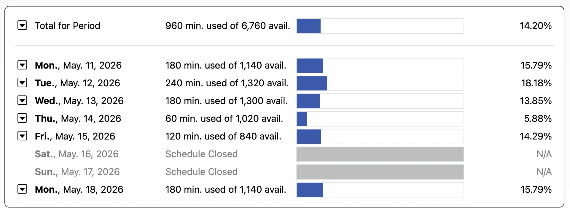
Based on the configuration options that you select, the report shows the utilization for each day and, at the bottom of the report, the utilization for the entire period.
Following each date listing (such as “October 28, 2022”), the report shows the number of minutes that were used (or filled with appointments) and the number of minutes that were available to be reserved on the day. The next column in each row shows a bar graph representing the percentage of available time on the day that was filled with appointments (as shown in blue). The final column in each row shows the percentage of available time on the day that was filled with appointments. The last line in the report shows the same information but for the entire period instead of per day.
If a day appears in gray with a message that reads “Schedule Closed,” then that means that that day was not available for scheduling. This could be because it’s a closed day of the week (such as if you’ve set your schedule to be closed every Saturday in Schedule Management), or because you’ve listed the day as a holiday or closure in the “Manage Holidays & Closures” tool in Schedule Management. It could also be because the day is before the starting date or after the ending date of the schedule (as set in Schedule Management). These days do not count in the calculation of utilization.